We recently revamped Deliveroo’s digital colour palette. It was our first step toward making our design system foundations more accessible. Building a good colour foundation takes time, but the effort is worth it. These support future improvements and help make our products more inclusive.
Why was it necessary for us to focus on colours? Colours play a major role in our digital products: they’re everywhere. Currently, our products are globally affected by poor colour contrast. We had to improve the colour contrast ratio to meet Level AA accessibility standards. This initiative will positively impact our design system and the markets we cater to.
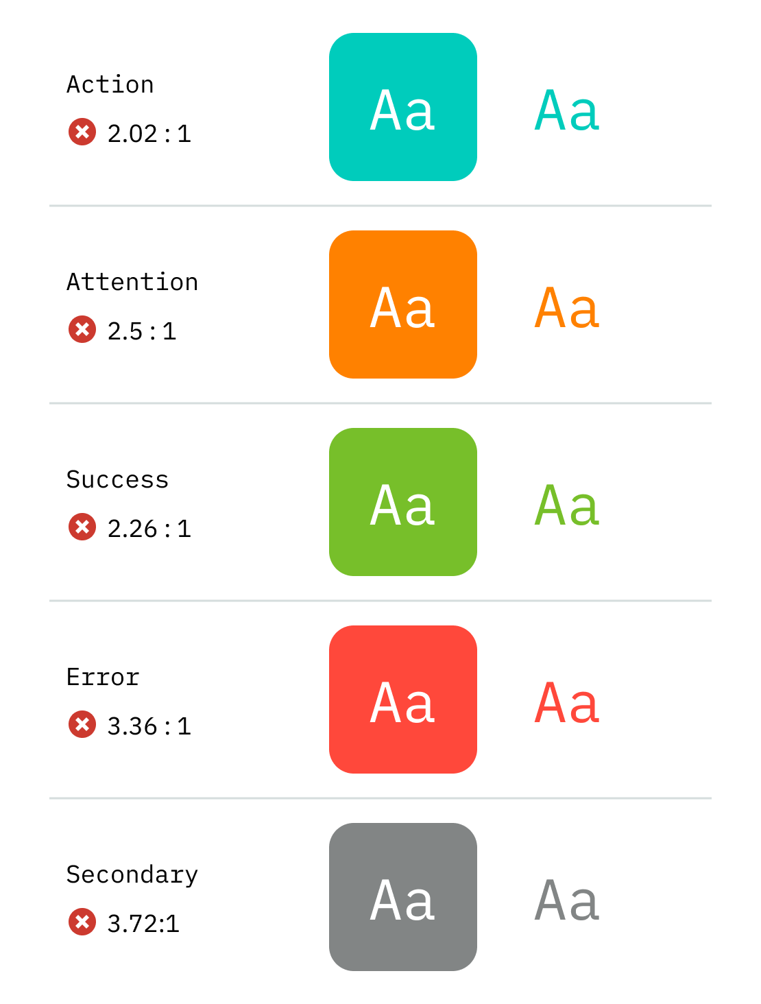
One of the top accessibility issues across platforms was the lack of colour contrast.
The colours that caused the most problems were bright teal, grey, red, green, and orange. We used these colours in our apps and products for text, icons, borders, and backgrounds. The widespread use of these colours worsened the accessibility issues we were facing.
Five of the most used colours failed on contrast ratio (AA), making them inaccessible.
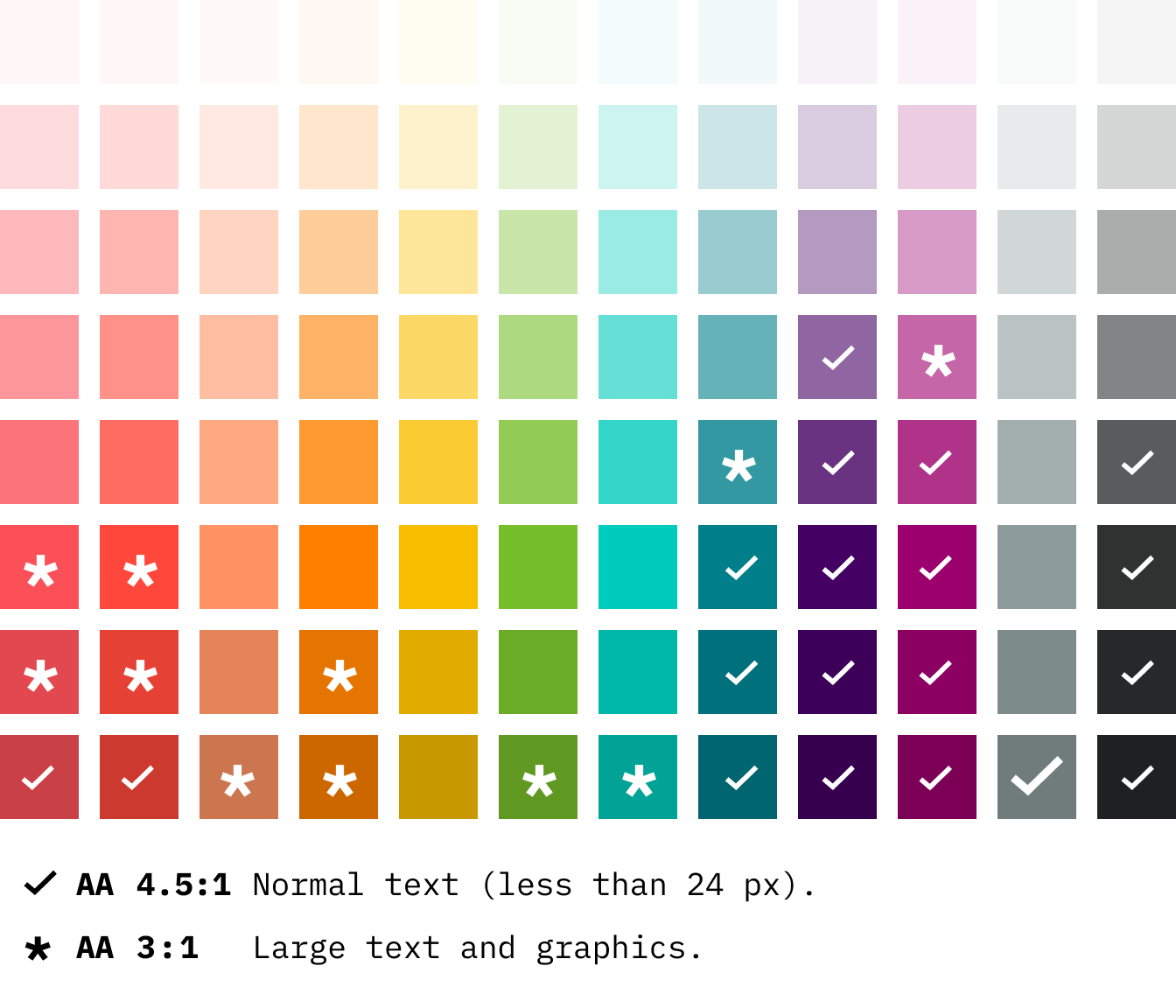
The current colour palette came from Deliveroo’s rebrand in 2016. Unfortunately, the palette had several limitations. Only a few colours met level AA accessibility standards. Moreover, the palette had uneven visual weight, and we needed more tints for our product UI.
This one’s a bit more technical. Our foundations don’t have a single source of truth; they have many (seven, to be precise). Having isolated colour definitions in design and code, including backend services, isn’t scalable. It’s also not easy to maintain and making changes is very time-consuming.
One colour palette and seven different places to maintain it.
Foundations are the core of Design Systems. They’re the visual attributes such as colour, type, spacing, elevation, and motion–to name a few. They propagate throughout the entire system and suite of products. How we approach them has a knock-on effect on disciplines, components, and processes.
The first goal was to create a new colour palette to help us be WCAG2.1 level AA compliant. Why? We needed a new set of colours and a better system to fix the palette limitations and the poor colour contrast.